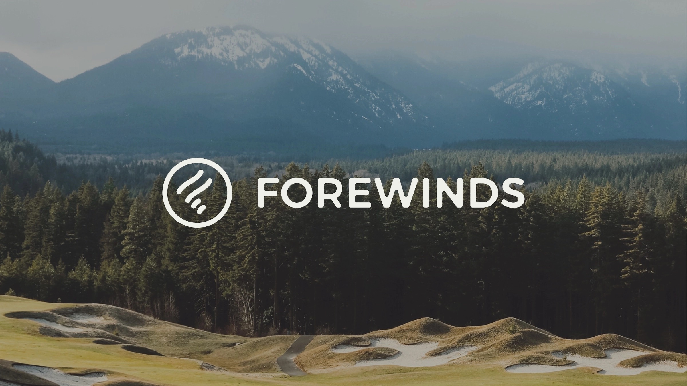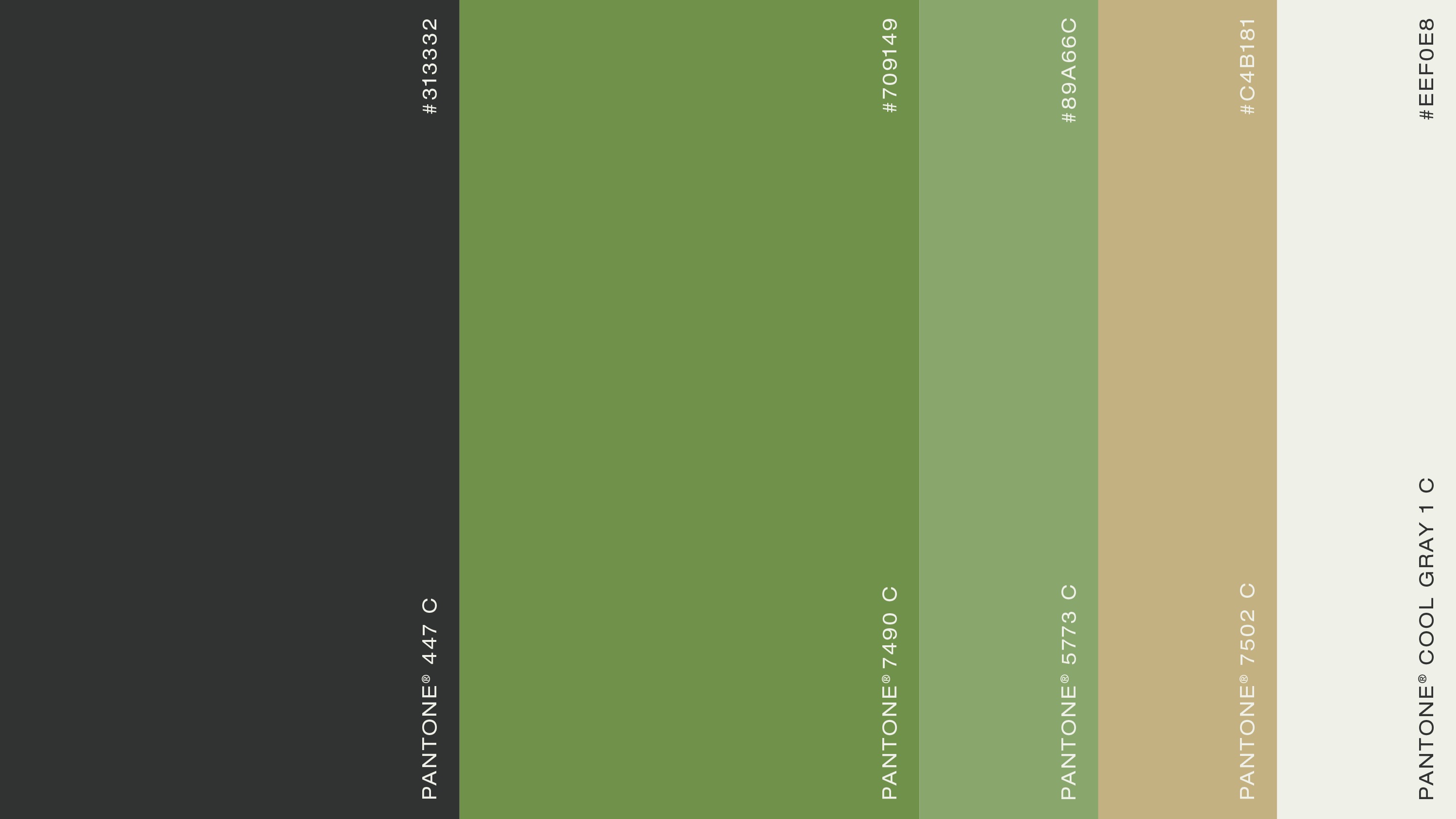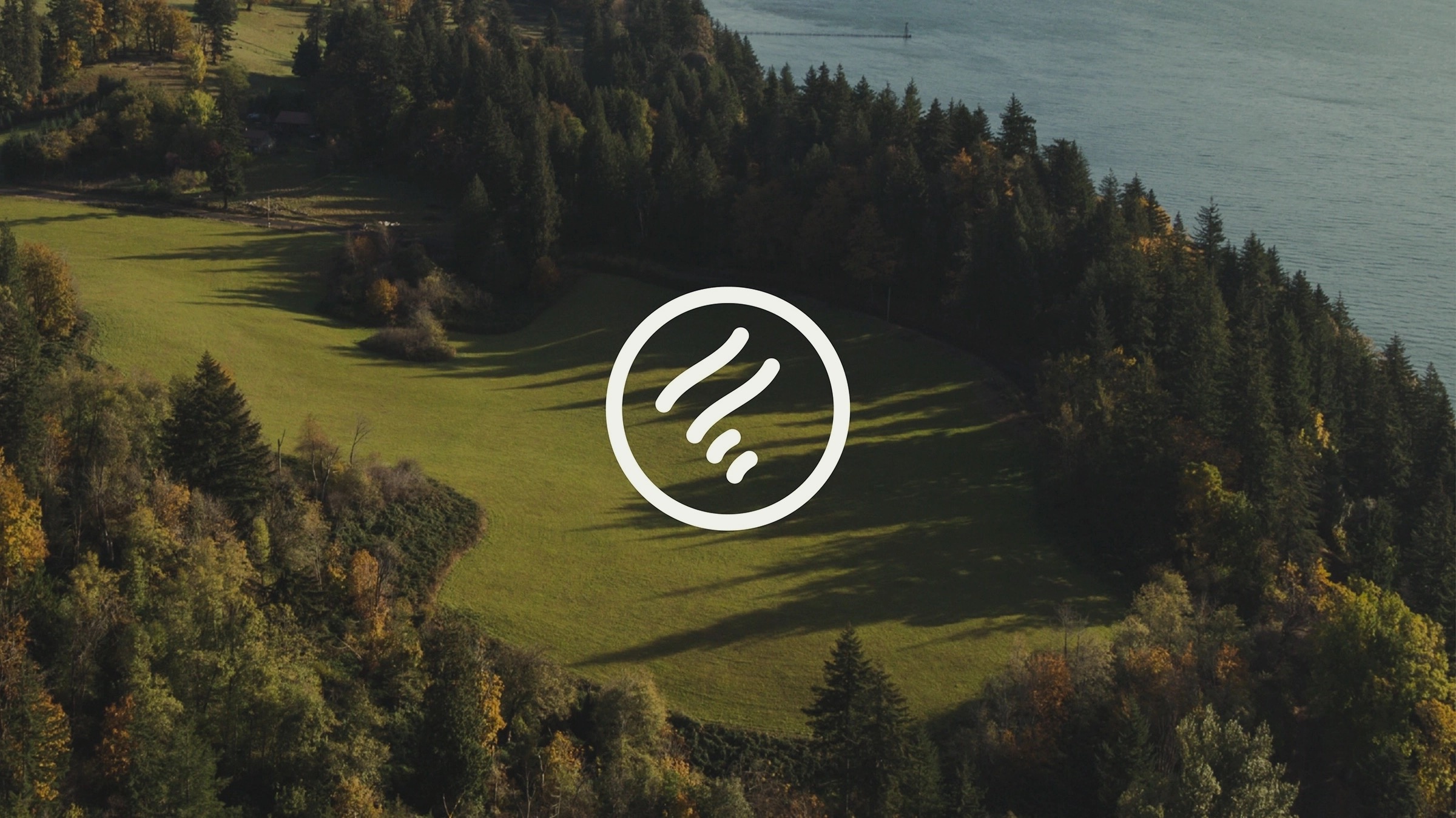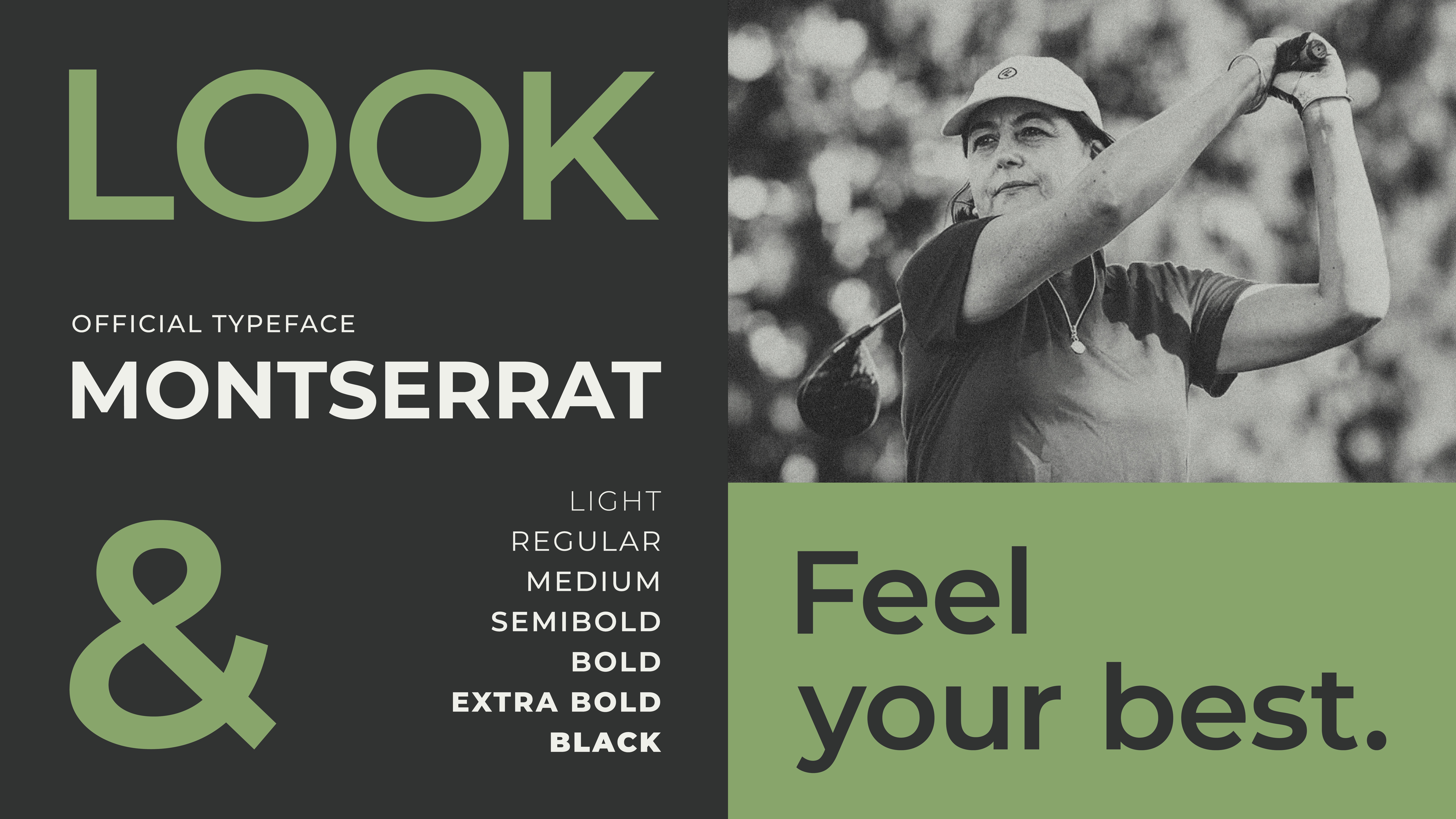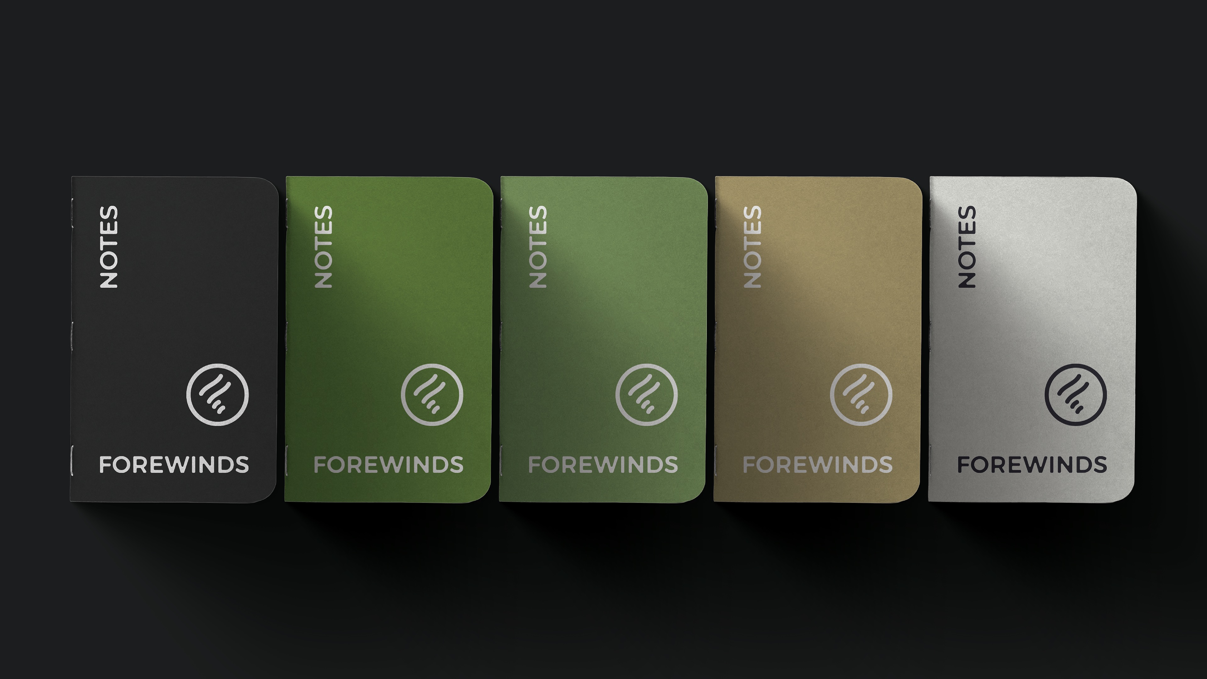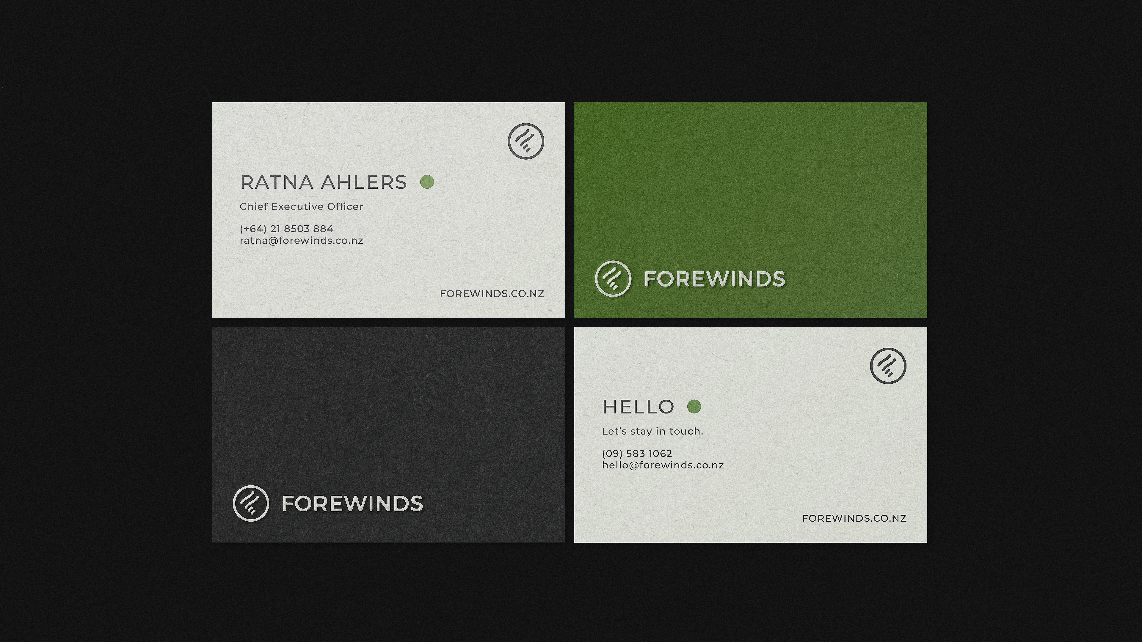
In April 2021, I helped develop the visual identity for Forewinds, a women’s golf apparel brand. The project included logo design, colour palette, typography, business cards, and stationery.
The focus was on creating a clean, modern system, refining the logo through multiple iterations and selecting colours and type that felt cohesive across applications.